Plurana
Making a new generative design product familiar and convenient to use
Making a new generative design product familiar and convenient to use
Plurana
Making a new generative design product familiar and convenient to use
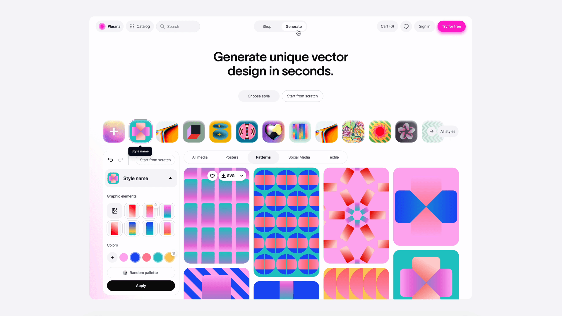

Plurana is a new design platform that allows you to generate, shop and explore high-quality fully editable vector graphics.
Plurana is a new design platform that allows you to generate, shop and explore high-quality fully editable vector graphics.
TLDR Summary
Through extensive customer development, the platform was tailored to align with user needs, emphasizing ease of use and high-quality outputs. The development process involved iterative prototyping and user testing, leading to a simplified user interface that integrates traditional design elements with innovative AI-driven tools. Key features, such as the dual-mode capability allowing users to switch between a generative tool and a traditional shop, were refined based on feedback to ensure intuitive navigation and functionality. The result is a balanced design tool that supports creative exploration while maintaining a familiar shopping experience.
Through extensive customer development, the platform was tailored to align with user needs, emphasizing ease of use and high-quality outputs. The development process involved iterative prototyping and user testing, leading to a simplified user interface that integrates traditional design elements with innovative AI-driven tools. Key features, such as the dual-mode capability allowing users to switch between a generative tool and a traditional shop, were refined based on feedback to ensure intuitive navigation and functionality. The result is a balanced design tool that supports creative exploration while maintaining a familiar shopping experience.
My role
I led design of the project from its inception. Initially the sole designer, I was later joined by a skilled junior designer. Together with the founders and engineering team, I developed the platform's design from the ground up, translating the initial vision and technical possibilities into precise user flows and interface designs.
I led design of the project from its inception. Initially the sole designer, I was later joined by a skilled junior designer. Together with the founders and engineering team, I developed the platform's design from the ground up, translating the initial vision and technical possibilities into precise user flows and interface designs.
Why it is interesting
Ever since Muriel Cooper's pioneering Visible Language workshops at MIT, designers have envisioned tools that could generate flexible graphic layouts governed by simple rules or constraints. Plurana aims to fulfill this vision, integrating automation with thoughtful human influence, ensuring significant user interaction and collaboration with the interface. This combination sets Plurana apart as it marries historical design aspirations with modern technological capabilities.
Ever since Muriel Cooper's pioneering Visible Language workshops at MIT, designers have envisioned tools that could generate flexible graphic layouts governed by simple rules or constraints. Plurana aims to fulfill this vision, integrating automation with thoughtful human influence, ensuring significant user interaction and collaboration with the interface. This combination sets Plurana apart as it marries historical design aspirations with modern technological capabilities.
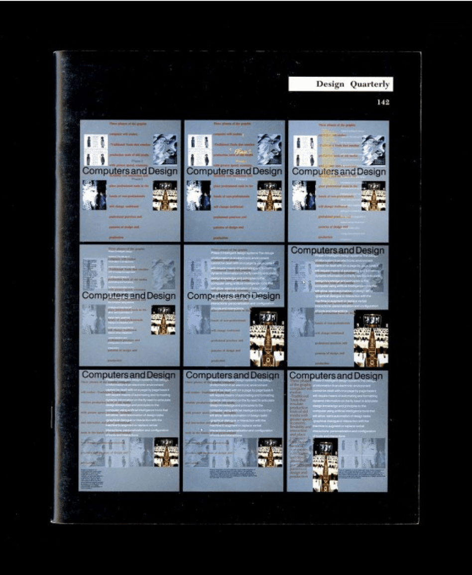

Design Quarterly 142, Walker Art Center Archives, generative layouts
Plurana generative layouts
Objectives and Benchmarks
As a new service, our goal was to develop a comprehensive design platform from conceptualisation to a market-ready product. This process involved testing our hypotheses regarding product-market fit, pricing models, and securing investment.
As a new service, our goal was to develop a comprehensive design platform from conceptualisation to a market-ready product. This process involved testing our hypotheses regarding product-market fit, pricing models, and securing investment.
Results
As a new service, our goal was to develop a comprehensive design platform from conceptualisation to a market-ready product. This process involved testing our hypotheses regarding product-market fit, pricing models, and securing investment.
As a new service, our goal was to develop a comprehensive design platform from conceptualisation to a market-ready product. This process involved testing our hypotheses regarding product-market fit, pricing models, and securing investment.
Discovering
Initial Resources and Vision
We started with just an extensieve library of unique vector elements and a tool that could generate patterns from predefined compositions. The challenge was to align our technology and database with user needs, adapt our offerings to user demands, create an intuitive interface, and maintain broad yet professional appeal.
We started with just an extensieve library of unique vector elements and a tool that could generate patterns from predefined compositions. The challenge was to align our technology and database with user needs, adapt our offerings to user demands, create an intuitive interface, and maintain broad yet professional appeal.
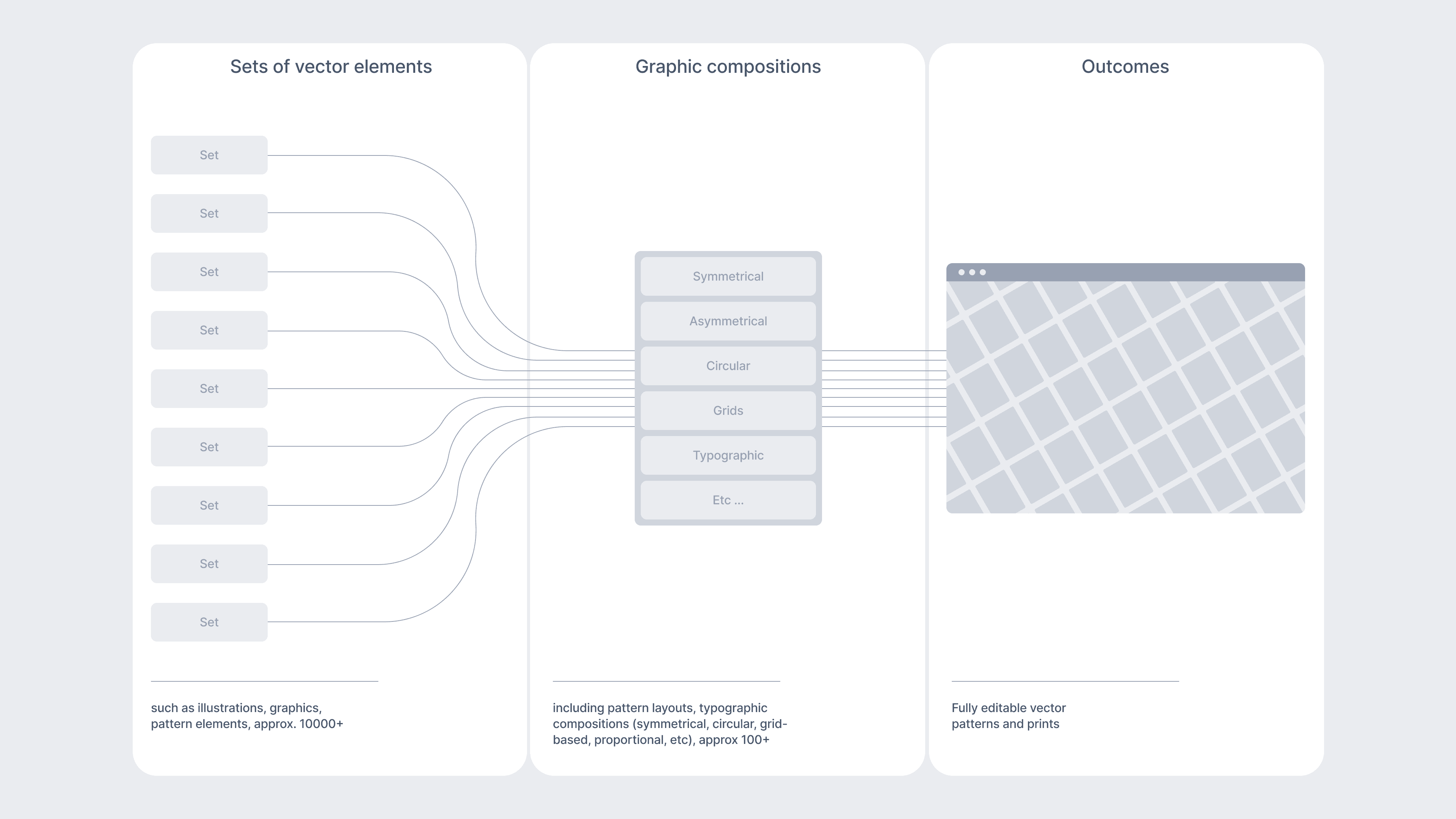

The structure of the database
Customer Development Insights
In collaboration with the founders, we conducted extensive interviews with designers, studio founders, marketing professionals, These revealed:
In collaboration with the founders, we conducted extensive interviews with designers, studio founders, marketing professionals, These revealed:
A mere pattern generator was too limited; a broader audience needed addressing.
A mere pattern generator was too limited; a broader audience needed addressing.
In the modern design process, nobody starts from scratch; assets like generic design systems or social media templates are crucial.
In the modern design process, nobody starts from scratch; assets like generic design systems or social media templates are crucial.
Users need directional support when generating designs from text prompts, as opposed to just using pre-made templates.
Users need directional support when generating designs from text prompts, as opposed to just using pre-made templates.
There's a general trend toward popular templates on large design platforms, which often sacrifice quality for quantity, particularly in vector graphics and illustrative shapes.
There's a general trend toward popular templates on large design platforms, which often sacrifice quality for quantity, particularly in vector graphics and illustrative shapes.
Competitors research
We analysed potential competitors and the broader market for innovative design tools, focusing on those tailored to specific design challenges, such as AI vector generation, editable template platforms, creative assets and stock marketplaces.
We analysed potential competitors and the broader market for innovative design tools, focusing on those tailored to specific design challenges, such as AI vector generation, editable template platforms, creative assets and stock marketplaces.
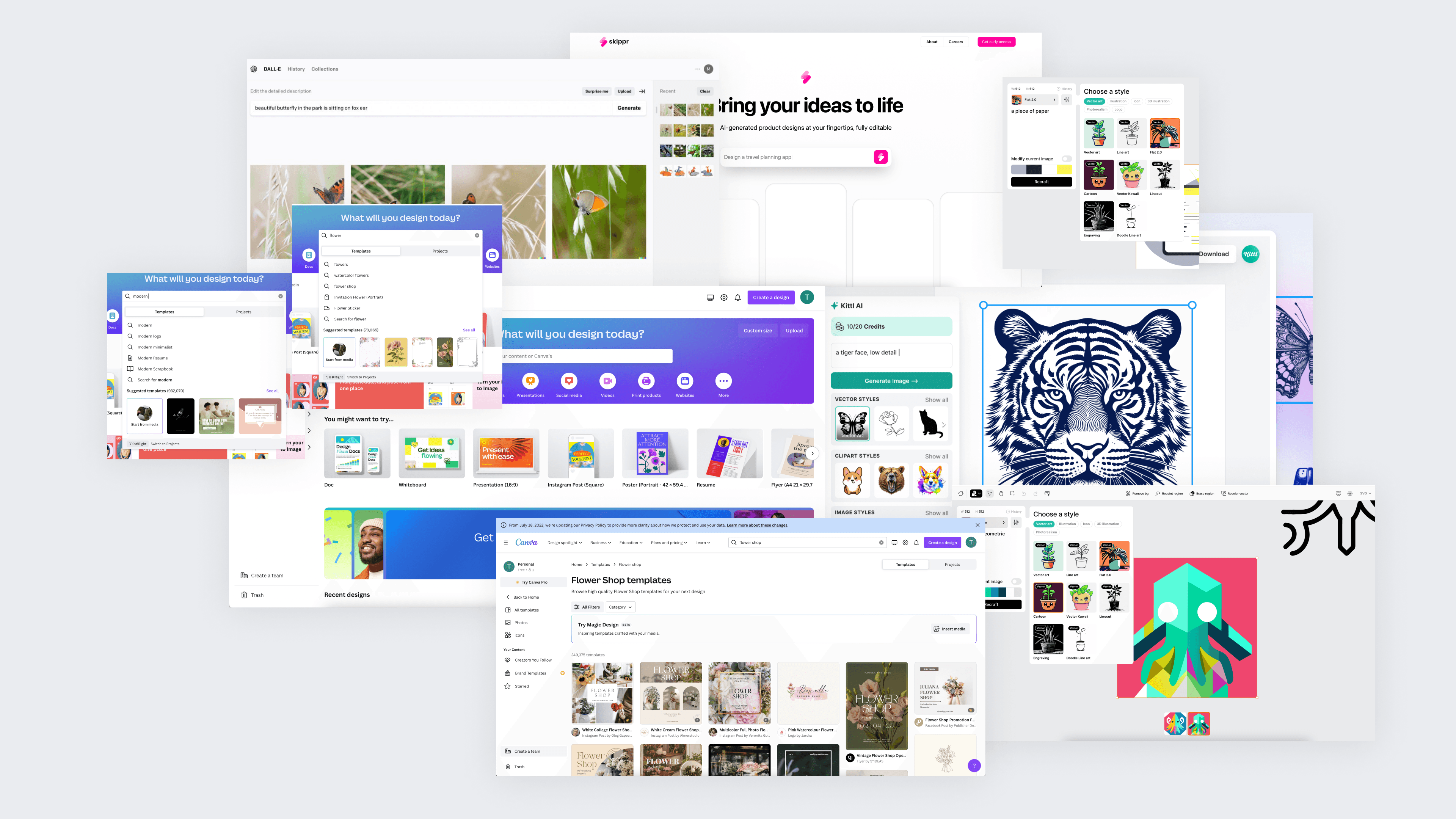

Screenshots of some of the key competitors
Based on our discovery, we realised that there is a tension in adapting generative and prompt-based interfaces: on the one hand, they allow generating unique outcomes (what all designers want in our cus dev) but they are unpredictable and difficult to control black boxes. On the other hand, traditional shops and template marketplaces with limited editing capabilities are open and user-friendly but lack experimentation and variability. Uniting these two worlds would serve as out guiding principle for the project.
Based on our discovery, we realised that there is a tension in adapting generative and prompt-based interfaces: on the one hand, they allow generating unique outcomes (what all designers want in our cus dev) but they are unpredictable and difficult to control black boxes. On the other hand, traditional shops and template marketplaces with limited editing capabilities are open and user-friendly but lack experimentation and variability. Uniting these two worlds would serve as out guiding principle for the project.
Defining
We translated our findings into a suitable mental model for users, balancing business and usability needs. We explored several interface models:
We translated our findings into a suitable mental model for users, balancing business and usability needs. We explored several interface models:
Sequence/Step by step tool: Too much friction, feels like a toy.
Sequence/Step by step tool: Too much friction, feels like a toy.
Canvas Editor: High development effort, limited content discovery.
Canvas Editor: High development effort, limited content discovery.
Gallery + Editor mix (similar to Canva): Most suitable, aligning with key findings.
Gallery + Editor mix (similar to Canva): Most suitable, aligning with key findings.
Prompt Input + Gallery: if somehow integrated with the gallery, but still limited discovery.
Prompt Input + Gallery: if somehow integrated with the gallery, but still limited discovery.
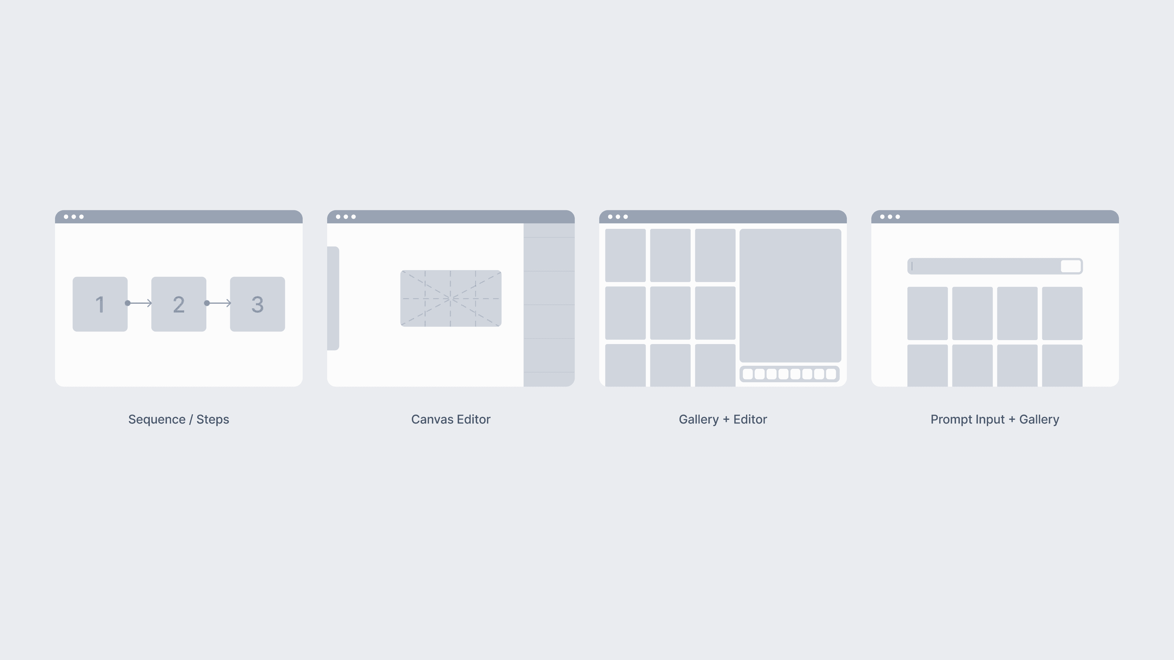

Mental models explored
The Gallery + Editor was considered the most suitable as it aligned with the our key findings in discovery:
The Gallery + Editor was considered the most suitable as it aligned with the our key findings in discovery:
Emphasizing Presets and Resources: Avoids the fear of a blank page, inspiring and growing the design community by showcasing possibilities.
Emphasizing Presets and Resources: Avoids the fear of a blank page, inspiring and growing the design community by showcasing possibilities.
Algorithmic Transparency: Exposes the structure of our tool without making it a black box.
Algorithmic Transparency: Exposes the structure of our tool without making it a black box.
Shop Integration: For users who prefer not to explore new tools, offering a straightforward business-wise solution.
Shop Integration: For users who prefer not to explore new tools, offering a straightforward business-wise solution.
Flexible User Flow: Allows designers to upload their logos or illustrations and experiment with layouts.
Flexible User Flow: Allows designers to upload their logos or illustrations and experiment with layouts.
Platform structure
We divided Plurana into two segments: a traditional shop and a generative tool. This balanced approach offers stability and familiarity, giving users the choice to explore extensively or select pre-made options.
We divided Plurana into two segments: a traditional shop and a generative tool. This balanced approach offers stability and familiarity, giving users the choice to explore extensively or select pre-made options.
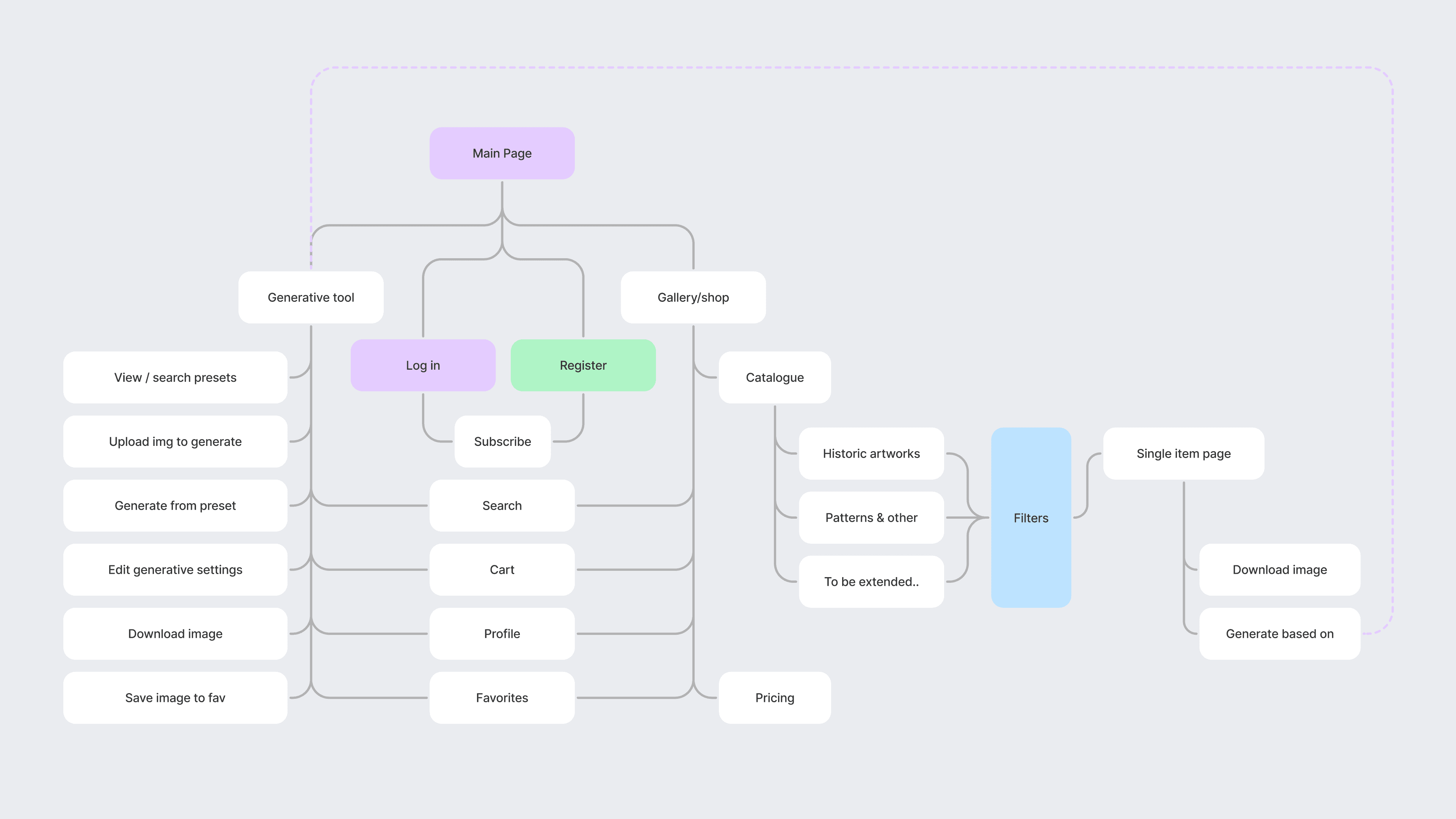

Platform structure
Structuring the database
Initial user research showed our database didn't fully match designer workflows. We introduced a structure called Sets or Styles, guiding designers with familiar visual references.
Initial user research showed our database didn't fully match designer workflows. We introduced a structure called Sets or Styles, guiding designers with familiar visual references.
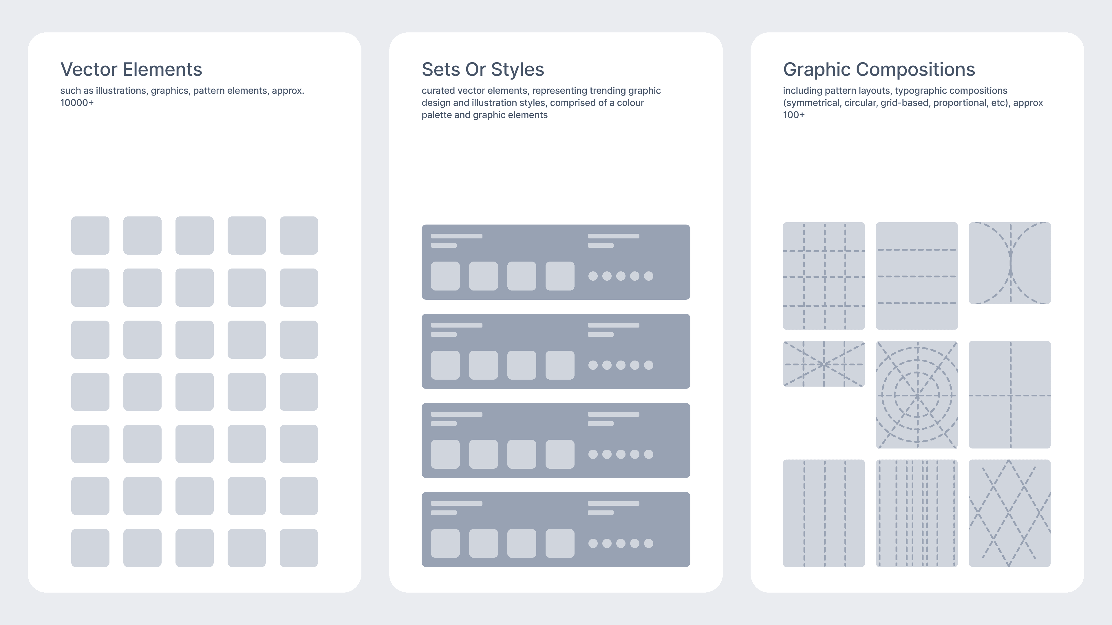

Database with presets
That insight was also based on the analysis of the competitors and popular design and marketing tools and practices. Below are the Canva filters that reflect very well the way designers describe their works or how they search for design refs and templates.
That insight was also based on the analysis of the competitors and popular design and marketing tools and practices. Below are the Canva filters that reflect very well the way designers describe their works or how they search for design refs and templates.
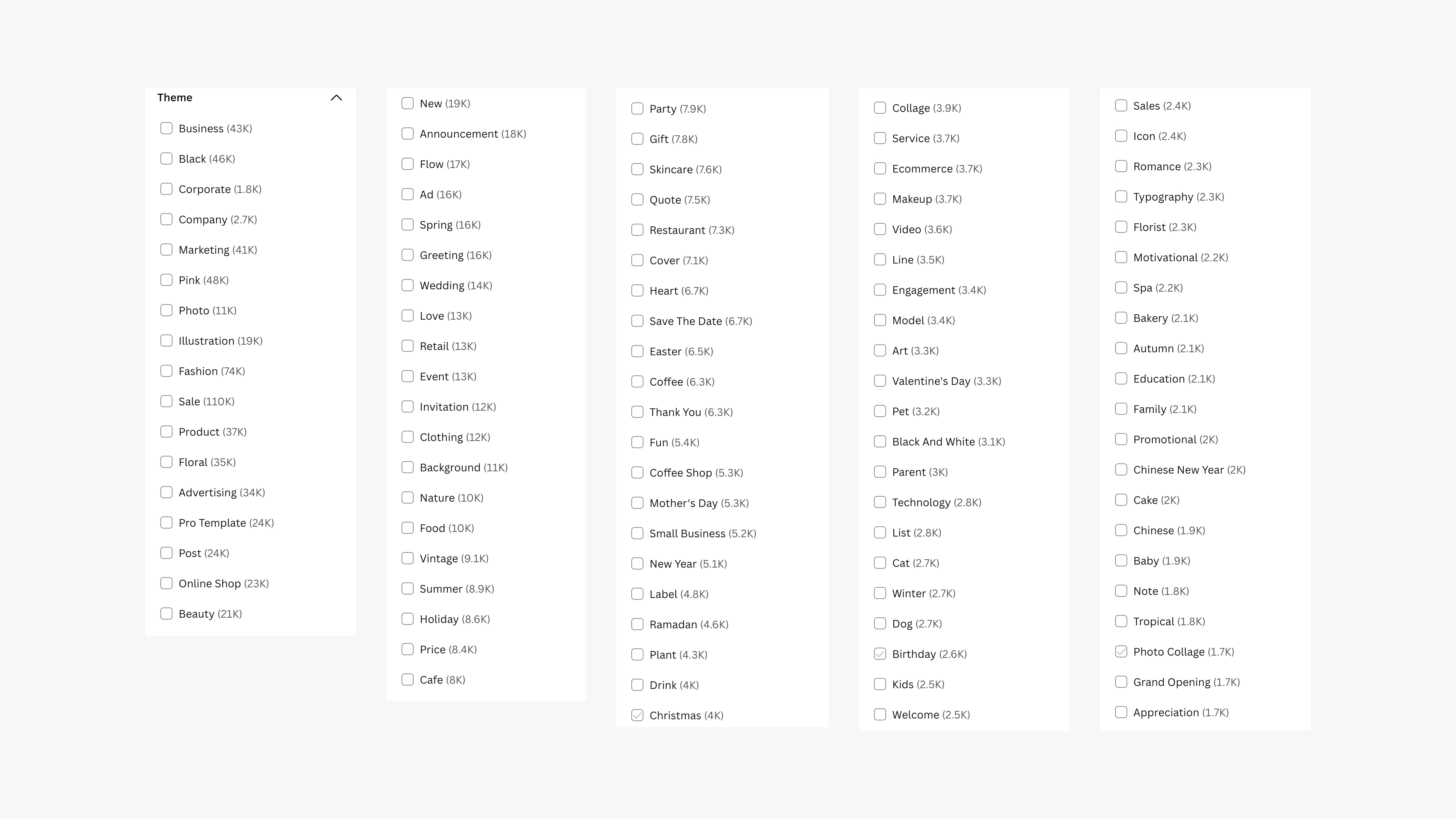

Canva content filtering
Developing
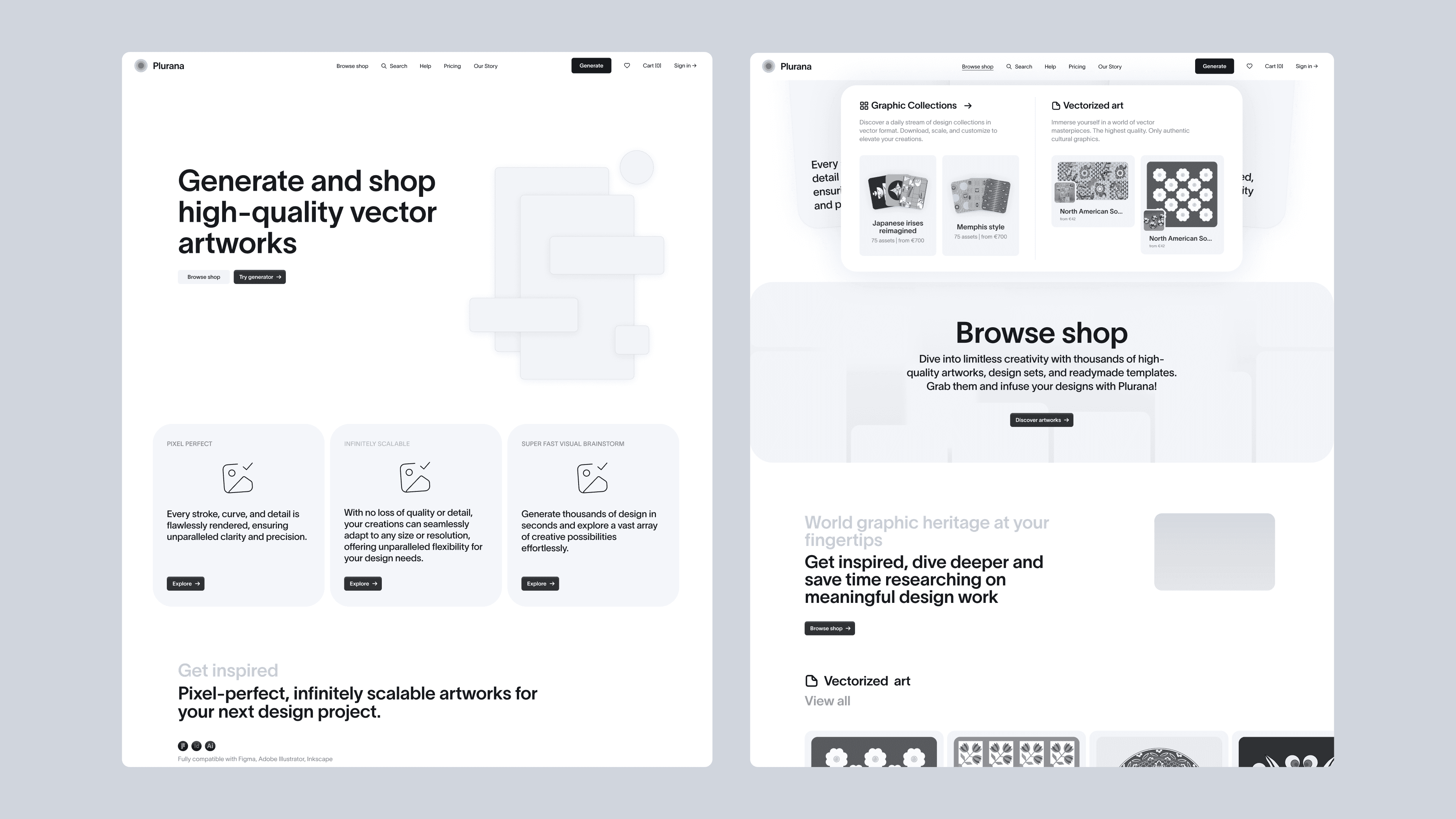

wireframing
Framing the content right
As the content played the crucial role in that project, I would go from low and high fidelity prototyping back and forth, otherwise it is difficult to evaluate what works best for the particular content of the platform.
As the content played the crucial role in that project, I would go from low and high fidelity prototyping back and forth, otherwise it is difficult to evaluate what works best for the particular content of the platform.
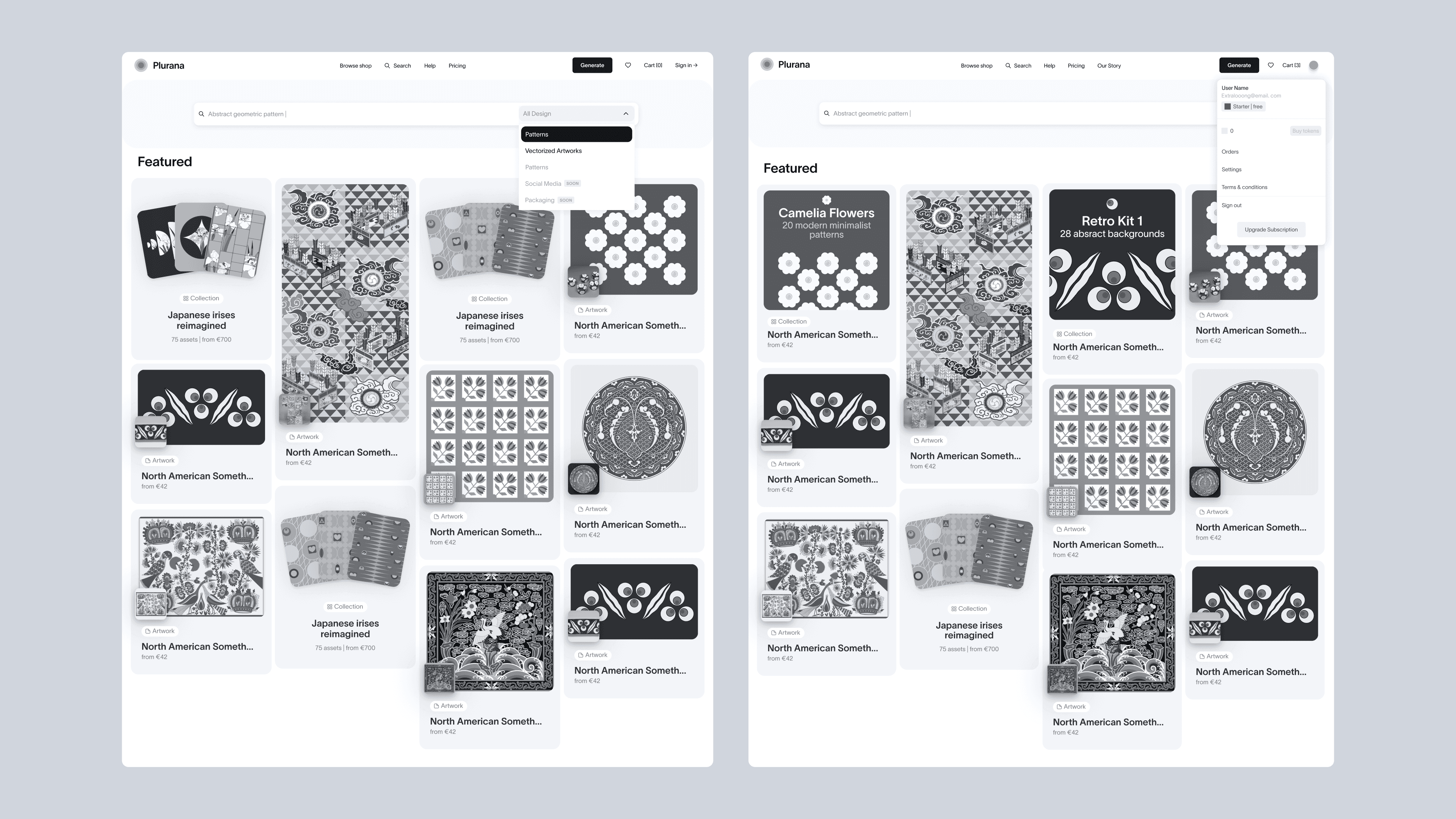

wireframing
Revamping the navigation
Initially, we created two separate websites for different user scenarios (a shop and a generative interface). Tests showed that this menu structure was confusing for users, so after several iterations, we implemented a simple switch solution in the top navigation that allowed to travel between the two major parts of the website.
Initially, we created two separate websites for different user scenarios (a shop and a generative interface). Tests showed that this menu structure was confusing for users, so after several iterations, we implemented a simple switch solution in the top navigation that allowed to travel between the two major parts of the website.
Navigation
Search, filtering and catalogue navigation
We added search and multifaceted filtering for the shop, initially indexing only the shop but planning to include generative presets later. We structured our categories based on competitor analysis to find the right product language.
We added search and multifaceted filtering for the shop, initially indexing only the shop but planning to include generative presets later. We structured our categories based on competitor analysis to find the right product language.
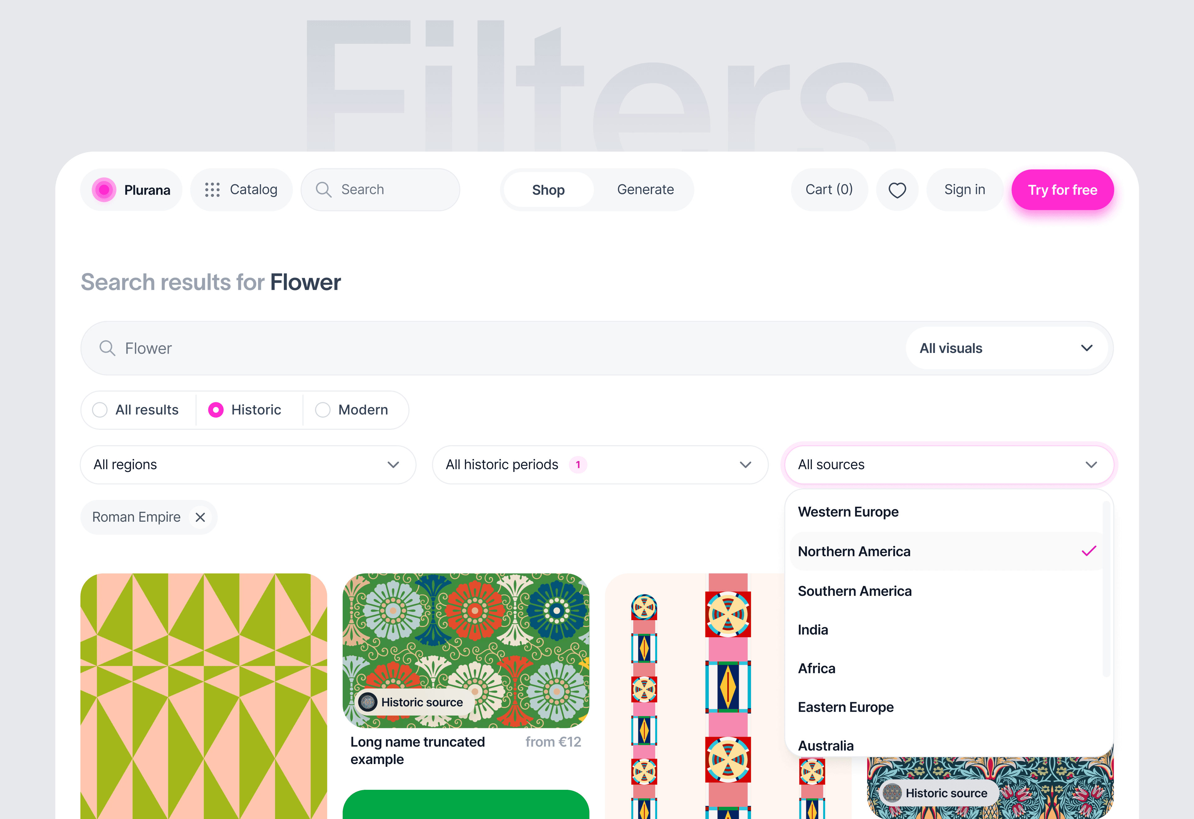

Filters
Shop structure and image grid
The shop features high-quality vectorized patterns, both human-made and generated. We tested various grid sizes and chose smaller images to showcase the platform's diverse content and increase user engagement.
The shop features high-quality vectorized patterns, both human-made and generated. We tested various grid sizes and chose smaller images to showcase the platform's diverse content and increase user engagement.
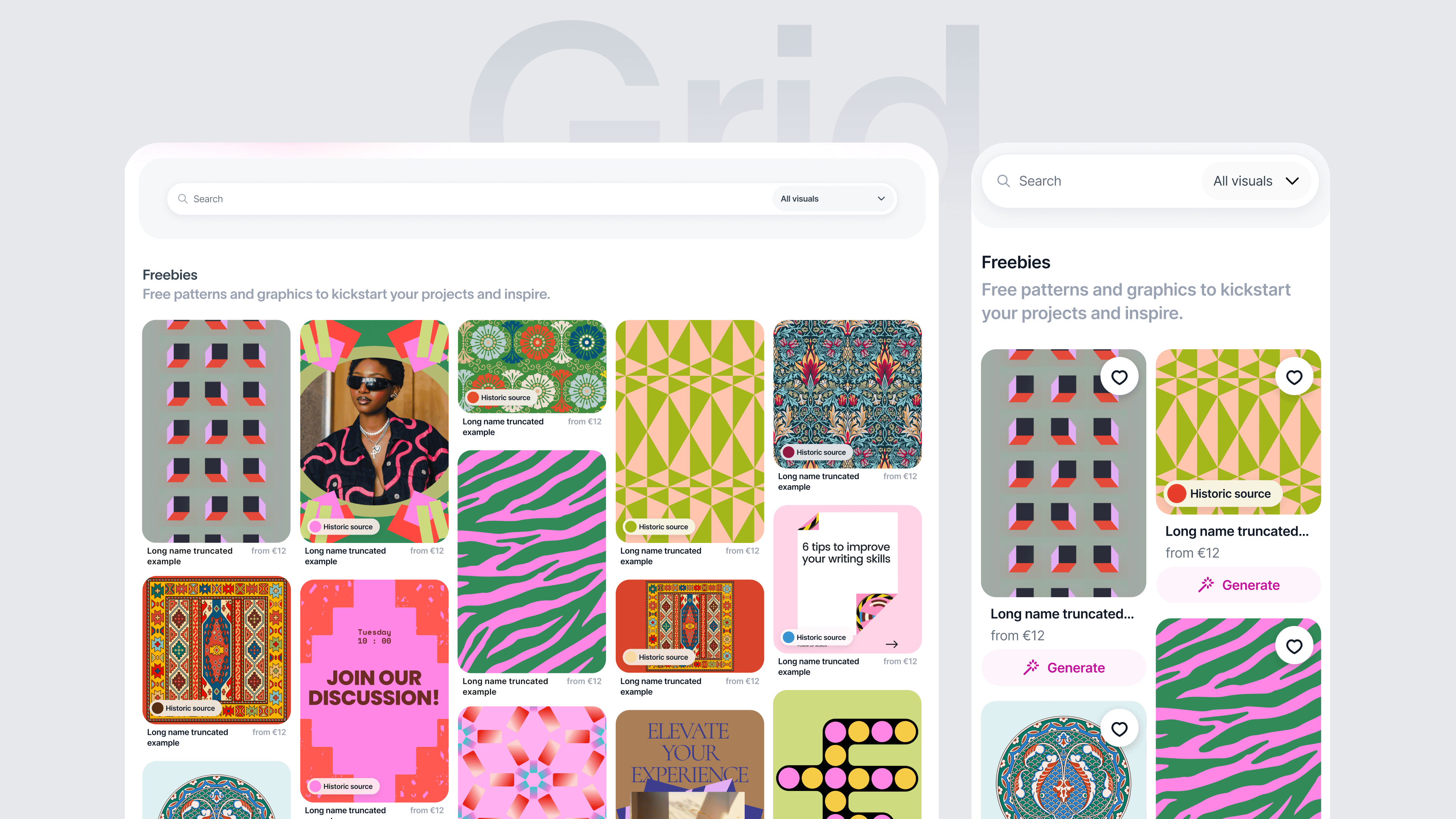

Image grid
Card design
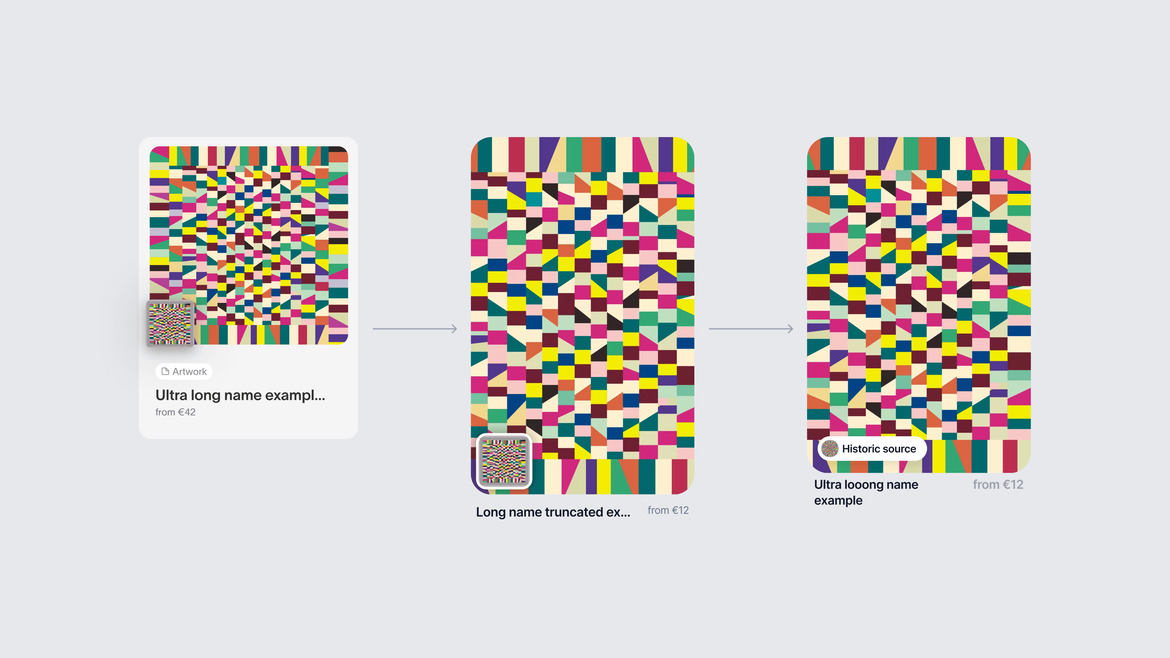
Highlighting the quality and unique origin of our content was essential for our brand and product mission. So, we added relevant historic details in a popover to our authentic historic content. We tested several interaction options using quick hallway testing and chose the best-performing one.
Highlighting the quality and unique origin of our content was essential for our brand and product mission. So, we added relevant historic details in a popover to our authentic historic content. We tested several interaction options using quick hallway testing and chose the best-performing one.

Design Quarterly 142, Walker Art Center Archives, generative layouts
Plurana generative layouts
Strengthening connections
Building up on the ‘switch’ idea we added the ‘generate’ button to some artworks in the shop to fully connect both sides of the platform and reinforce user exploration. By clicking it user is taken to a generative part of the platform where they can generate more similar patterns based on the style they found in the shop.
Building up on the ‘switch’ idea we added the ‘generate’ button to some artworks in the shop to fully connect both sides of the platform and reinforce user exploration. By clicking it user is taken to a generative part of the platform where they can generate more similar patterns based on the style they found in the shop.
Connection between shop and generator
The design of the generator
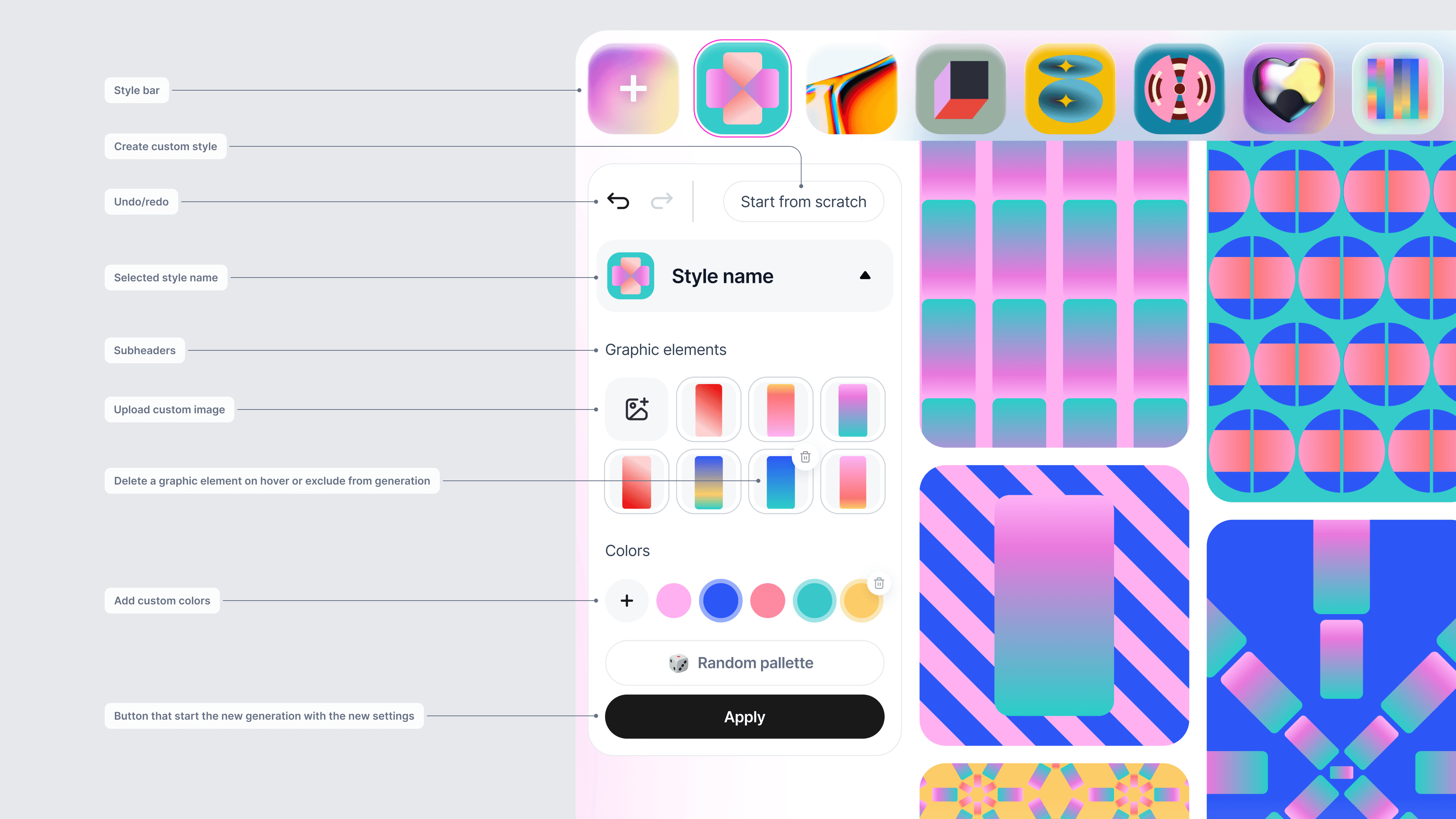
The generator design was challenging, undergoing multiple iterations and usability testing. We narrowed down the generator’s list of features and after the series of brainstorming, free ideation, prototyping to align the team and high-fidelity protypes for usability testing, we arrived at the several key solutions:
The generator design was challenging, undergoing multiple iterations and usability testing. We narrowed down the generator’s list of features and after the series of brainstorming, free ideation, prototyping to align the team and high-fidelity protypes for usability testing, we arrived at the several key solutions:
Prioritizing Styles: Styles (or presets) became the entry point to the generative interface, prioritizing them over other content and settings. That was quite a challenge from the UI perspective.
Prioritizing Styles: Styles (or presets) became the entry point to the generative interface, prioritizing them over other content and settings. That was quite a challenge from the UI perspective.
User Scenarios: We focused on two crucial scenarios: using custom imagery (start from scratch/upload media) and browsing/editing existing presets. Browsing is currently emphasized over editing.
User Scenarios: We focused on two crucial scenarios: using custom imagery (start from scratch/upload media) and browsing/editing existing presets. Browsing is currently emphasized over editing.
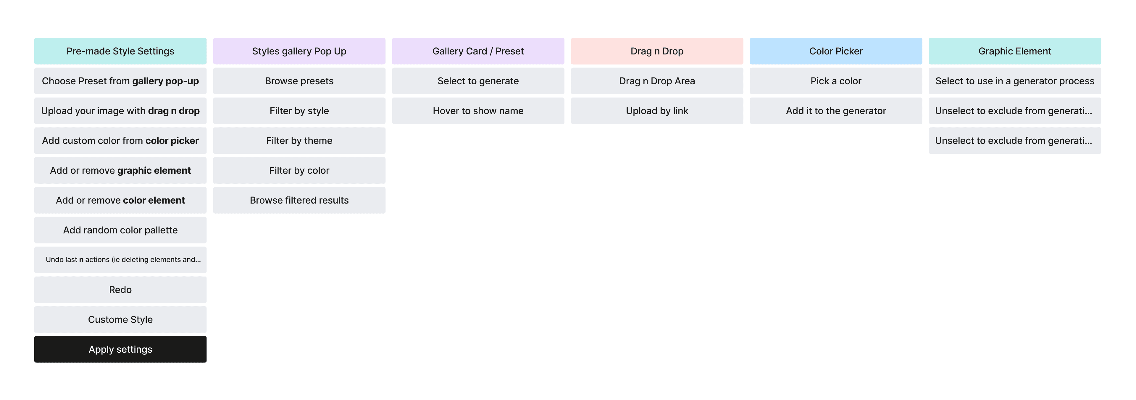

Image grid
I prepared a high-fidelity prototype for our 5 participants. We conducted these tests via zoom. We devised several simple and critical tasks for the interface. We asked to comment everything out loud and give as much inner process of analysis as the participants could.
I prepared a high-fidelity prototype for our 5 participants. We conducted these tests via zoom. We devised several simple and critical tasks for the interface. We asked to comment everything out loud and give as much inner process of analysis as the participants could.
A high-fid prototype where styles are hidden in separate menu
A high-fid prototype where styles are always visible
After the tests we introduced two key changes:
After the tests we introduced two key changes:
All users were confused by the option without the visible style bar, they explicitly preferred the more ‘overloaded’ interface as it gave much more clear indication as to what you can achieve with this new tool.
All users were confused by the option without the visible style bar, they explicitly preferred the more ‘overloaded’ interface as it gave much more clear indication as to what you can achieve with this new tool.
We also changed the name of the button from generate to apply, as again that was the participants perception of that element as the setting for generation.
We also changed the name of the button from generate to apply, as again that was the participants perception of that element as the setting for generation.

Final interface structure
Browsing pre-made styles library
Delivering
Visual and UI design
In terms of art direction, I was already presented with the brand colour (ultra bright Magenta), the logo and the typeface for headings. I tried to use the vibrant colour sparingly, reserving it primarily for the Generator part and other crucial CTAs.
In terms of art direction, I was already presented with the brand colour (ultra bright Magenta), the logo and the typeface for headings. I tried to use the vibrant colour sparingly, reserving it primarily for the Generator part and other crucial CTAs.

Design components
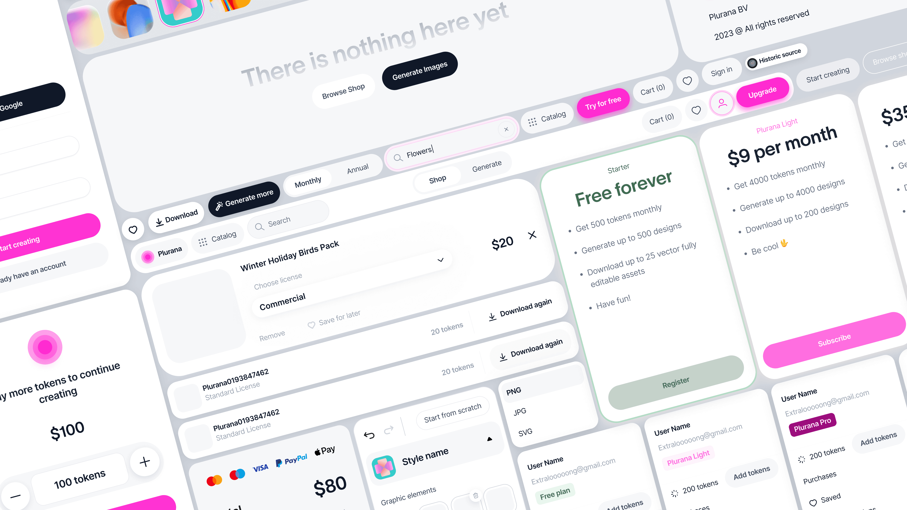
I kept the visual system as simple as possible, because the platform is itself very content heavy. As it is a new product, I prioritised visual consistency and conventional solutions over visual expressiveness.
I kept the visual system as simple as possible, because the platform is itself very content heavy. As it is a new product, I prioritised visual consistency and conventional solutions over visual expressiveness.
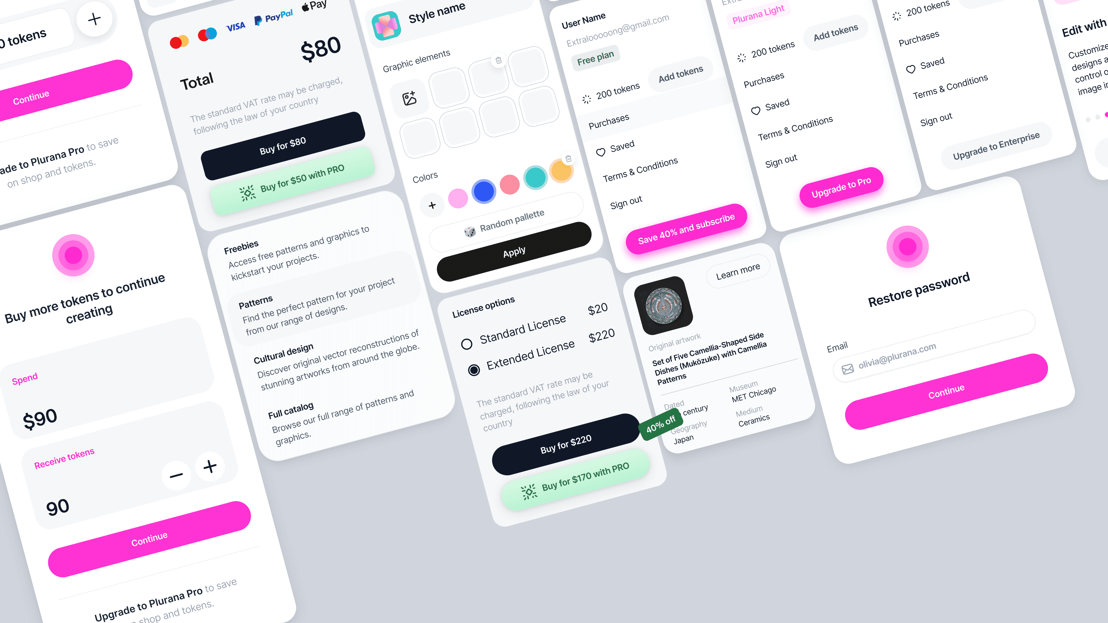

Design components
I organized the file into a simple and straightforward ui guide, so that future design teammates would not be overwhelmed. We worked closely with the development team from the very beginning, but delivering stage was especially intensive in terms of collaboration as a lot of the final design aspects went through multiple testing and QA sessions.
I organized the file into a simple and straightforward ui guide, so that future design teammates would not be overwhelmed. We worked closely with the development team from the very beginning, but delivering stage was especially intensive in terms of collaboration as a lot of the final design aspects went through multiple testing and QA sessions.
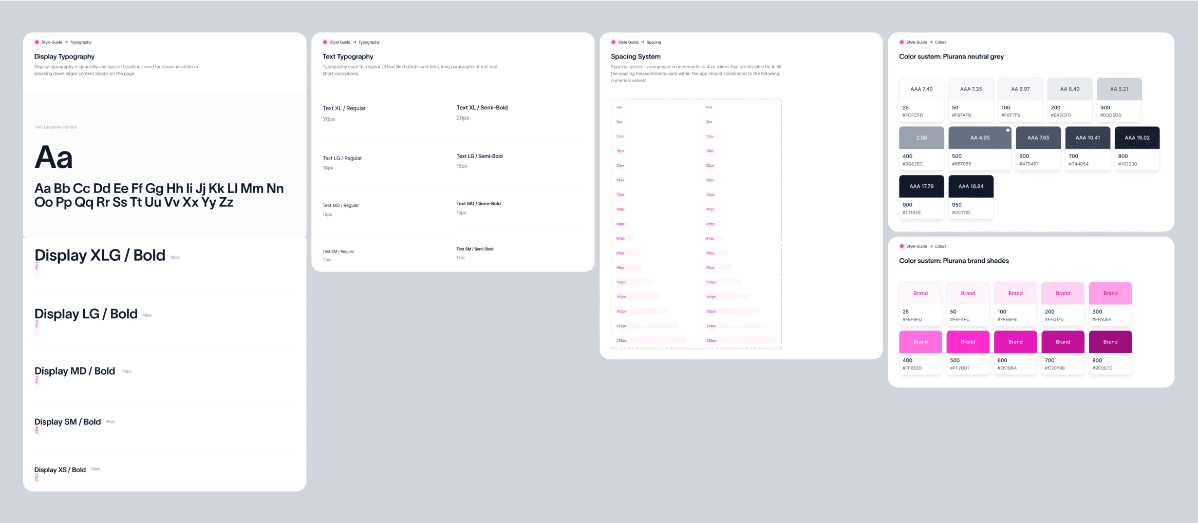

Design components
Promotional materials
Results
Following the MVP launch, Plurana secured significant financial support from Dutch Startup Programs and investors, earning recognition as one of the top tech + cultural startups in the Netherlands. The platform, although still in its early stages, shows positive user feedback.
Following the MVP launch, Plurana secured significant financial support from Dutch Startup Programs and investors, earning recognition as one of the top tech + cultural startups in the Netherlands. The platform, although still in its early stages, shows positive user feedback.
Contact Info
Contact Info
Contacts
Location :
London
Last Update :
July 2025
Typefaces :
Roobert by Display Foundry, Space Mono By Colophon Foundry
tools :
Figma, framer, after effects
Location :
London
Last Update :
July 2025
Typefaces :
Roobert by Display Foundry, Space Mono By Colophon Foundry
tools :
Figma, framer, after effects
Location :
London
Last Update :
July 2025
Typefaces :
Roobert by Display Foundry, Space Mono By Colophon Foundry
tools :
Figma, framer, after effects
X